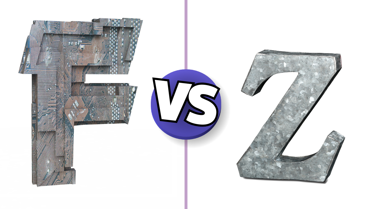
Have you ever wondered why some websites catch your eye immediately while others leave you confused? The secret often lies in their design patterns. One such pattern is the Z-shaped pattern, a clever layout trick that guides your eyes in a specific way. This article, I will explain what the Z-shaped pattern is, why it’s important, and how you can use it to make your website more effective.
What is the Z-Shaped Pattern
- The Z-shaped pattern guides the viewer’s eyes from left to right and top to bottom, forming a ‘Z’ shape.
- This pattern helps in enhancing user experience by making the content easier to follow.
- Implementing the Z-shaped pattern can boost conversion rates by strategically placing call-to-action buttons.
- It improves readability and focus by organising content in a logical flow.
- Comparing the Z-shaped pattern with the F-shaped pattern can help you decide which is best for different types of content.
Understanding the Z-Shaped Pattern
The Basics of the Z-Shaped Pattern
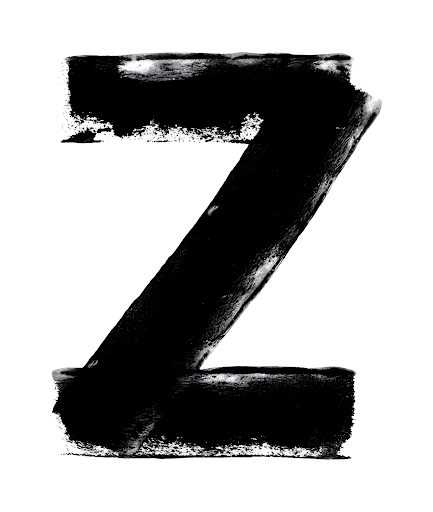
The Z-shaped pattern is a design that follows the natural route travelled by human eyes when reading: left to right and top to bottom. Basically, it consists of three parts:
- Your eyes will start from the top left of a page and move towards the top right (horizontal line).
- Then, they’ll move back to the left side of the page but a bit lower (diagonal line from the top right to the bottom left).
- Finally, they’ll repeat the first step (another horizontal line).
If you put these three imaginary lines together, you get a z-shape. This pattern helps guide the reader’s eyes smoothly across the page.
How the Z-Shaped Pattern Guides the Eye
The Z-pattern is a design that follows the natural route travelled by human eyes when reading: left to right and top to bottom. By planning your web design and copy accordingly, you’ll create a smoother flow for your visitors’ eyes, facilitating readability instead of putting them off. This pattern is also what immediately draws their eyes towards your call-to-action buttons rather than the privacy page.
Differences Between Z-Shaped and Other Patterns
The Z-pattern is different from other patterns like the F-pattern. While the Z-pattern is great for pages with less text and a need to grab attention quickly, the F-pattern is better for longer pages and blocks of text. The Z-pattern is all about simplicity and guiding the reader’s eyes to the most important elements, like your call-to-action buttons.
The Importance of the Z-Shaped Pattern in Web Design

Enhancing User Experience
When it comes to web design, the Z-shaped pattern is a game-changer. It guides the reader’s eyes naturally, making the browsing experience smoother and more intuitive. This pattern is used for applications that consist of an equal amount of mixed content types like images and text. By following this layout, you ensure that your visitors can easily find what they’re looking for without feeling overwhelmed.
Boosting Conversion Rates
One of the main reasons to use the Z-shaped pattern is its impact on conversion rates. By strategically placing your call-to-action (CTA) buttons along the Z-path, you can draw attention to them more effectively. This layout helps in highlighting your unique selling points and guiding users towards taking the desired action, whether it’s signing up for a newsletter or making a purchase.
Improving Readability and Focus
The Z-shaped pattern also enhances readability and focus. By organising content in a way that aligns with natural eye movement, you make it easier for visitors to digest information. This is particularly useful for pages with a mix of text and images, as it helps in maintaining a balanced visual hierarchy. In such situations, the readers first view the top horizontal line, then move diagonally down to the left, and finally scan the bottom horizontal line. This flow keeps the reader engaged and ensures that important information is not missed.
Implementing the Z-Shaped Pattern on Your Website

Alright, let’s dive into how you can actually use the Z-shaped pattern on your website. This pattern is a great way to draw user attention across and down the page, so that they notice key, important details. Here’s a simple breakdown to get you started.
1. Design the Layout
To effectively implement the Z-shaped pattern, start by designing your layout with a clear top-to-bottom and left-to-right flow. Here’s how:
- Top Horizontal Line: Place your main navigation bar and logo at the top. This is where users will first look. Ensure that the navigation is clear and easy to read, as it sets the stage for the rest of the content.
- Diagonal Line: Use a compelling image or a bold headline that draws the eye from the right side of the navigation down to the left side of the page. This could be an engaging hero image or a striking call-to-action that encourages users to continue exploring.
- Bottom Horizontal Line: Conclude with another horizontal element at the bottom of the page, such as a footer or additional CTAs. This is where you can reinforce your message or provide links to more information.
2. Utilize Visual Elements
Incorporate visual elements that guide the user’s eyes along the Z-path:
- Images and Graphics: Use images that align with the Z-pattern. For instance, place a large image on the right side of the page that captures attention and leads the eye down diagonally.
- Contrast and Color: Employ contrasting colors for key elements to make them stand out. For example, use a bright color for your CTAs that contrasts with the background, drawing attention to them as users move along the Z-path.
- Whitespace: Don’t underestimate the power of whitespace. It helps separate different sections and allows users to focus on the important elements without feeling overwhelmed.
3. Craft Engaging Content
Content should be strategically placed to follow the Z-pattern:
- Headlines and Subheadings: Use compelling headlines at the top to grab attention. Follow these with subheadings that guide users down the page, making it easy to scan for information.
- Bullet Points and Lists: Break up text with bullet points or numbered lists. This format is easier to read and aligns well with the Z-pattern, allowing users to quickly absorb key information.
- Calls-to-Action: Position your CTAs at the end of the Z-path. Make sure they are clear and actionable, prompting users to take the next step, whether it’s signing up for a newsletter or making a purchase.
4. Test and Optimize
Once your design is in place, it’s essential to test its effectiveness:
- User Testing: Conduct user testing to see how real users interact with your design. Observe if they follow the Z-pattern and if they notice the key elements you intended to highlight.
- Analytics: Use web analytics tools to track user behavior on your site. Monitor where users click and how far they scroll to determine if the Z-pattern is effectively guiding them through your content.
- Iterate: Based on feedback and analytics, make adjustments to improve the layout, content placement, and overall user experience.
This approach not only enhances the user experience but also increases the likelihood of conversions by strategically placing important information and calls-to-action.
Common Mistakes to Avoid with the Z-Shaped Pattern
When using the Z-shaped pattern in web design, it’s easy to make mistakes that can hinder your site’s effectiveness. Here are some common pitfalls to watch out for:
Overloading with Information
One of the biggest mistakes is cramming too much information into the design. Less is more when it comes to the Z-shaped pattern. If you overload the page, it can confuse visitors and make it hard for them to focus on the key elements.
Ignoring Visual Hierarchy
Visual hierarchy is crucial in guiding the user’s eye. If you ignore it, the Z-shaped pattern won’t work as intended. Make sure to use visual hierarchy principles to enhance your web design, ensuring that the most important elements stand out.
Misplacing Call-to-Action Buttons
The placement of your call-to-action (CTA) buttons is vital. Misplacing them can lead to missed opportunities. Always place your CTAs along the Z-path to ensure they catch the user’s eye and encourage action.
Comparing the Z-Shaped Pattern with the F-Shaped Pattern

When to Use Each Pattern
The Z-shaped and F-shaped patterns are both effective, but they shine in different scenarios. The Z-pattern is ideal for pages with less text and a single focus, like landing pages. On the other hand, the F-pattern works best for text-heavy pages, such as blog posts. Choosing the right pattern can make a big difference in user engagement.
Strengths and Weaknesses
Each pattern has its own strengths and weaknesses. The Z-pattern is great for simplicity and guiding the eye to a call-to-action. However, it might not be suitable for content-rich pages. The F-pattern excels in presenting lots of information but can overwhelm users if not designed carefully.
Visual Hierarchy in Both Patterns
Visual hierarchy is crucial in both patterns. In the Z-pattern, key elements like the call-to-action should be placed along the Z path. For the F-pattern, important information should be at the top and along the left side. This ensures that users see what you want them to see first.
Advanced Tips for Mastering the Z-Shaped Pattern
Combining with Other Design Elements
To truly make the most of the Z-shaped pattern, you should combine it with other design elements. For instance, using contrasting colours and bold fonts can help draw attention to key areas. The Z-pattern traces the path of your eyes when reading: left to right; top to bottom. This means you can strategically place important information along this path to ensure it gets noticed.
A/B Testing for Optimal Results
A/B testing is a great way to find out what works best for your audience. By creating two versions of a page and testing them, you can see which one performs better. This can help you fine-tune your Z-pattern layout to maximise its effectiveness. Remember, what works for one site might not work for another, so testing is key.
Adapting the Pattern for Mobile Devices
Mobile devices present a unique challenge for the Z-pattern. The smaller screen size means you need to be even more strategic about where you place your key elements. Make sure your call-to-action buttons are easily accessible and that your content is easy to read. Simplicity is crucial here, as a cluttered design can quickly turn users away.
Final Thoughts
In summary, the Z-shaped pattern is a powerful tool for web design. It guides the viewer’s eyes in a natural flow, making it easier for them to read and understand your content. By placing important elements like your logo, main message, and call-to-action along this path, you can capture attention and drive actions more effectively. Whether you’re designing a homepage or a landing page, using the Z-pattern can make a big difference. So, next time you’re working on a web project, remember to think about the Z-pattern and how it can help you create a more engaging and effective design.


One thought on “What’s the Z-Shaped Pattern and Why Should You Care?”