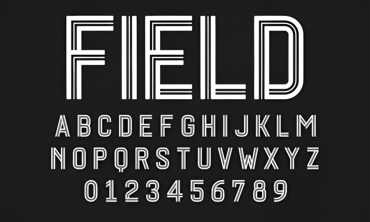
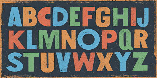
Choosing the right font for your website is more important than you might think. Fonts affect how your site looks, how easy it is to read, and even how people feel about your brand. This guide will help you understand why fonts matter and how to pick the best ones for your website.
Why Choosing the Best Fonts for Your Website is Important
- Fonts can greatly impact user experience by making your site easier or harder to read.
- The right font can help build and express your brand’s identity.
- Different types of fonts, like serif and sans-serif, serve different purposes.
- Always consider your audience when choosing fonts to ensure they resonate with your visitors.
- Technical aspects like font load times and browser compatibility are crucial for a smooth user experience.
Understanding the Importance of Fonts in Web Design

Fonts play a crucial role in web design, impacting everything from user experience to brand identity. Let’s dive into why fonts are so important.
Impact on User Experience
Fonts are a big part of how users feel when they visit your site. Typography is critical, accounting for a large percentage of your website’s design. If your text is hard to read, visitors might leave quickly. On the other hand, a good font can make your site more enjoyable and keep people around for longer.
Role in Brand Identity
Your choice of font says a lot about your brand. Fonts should match the rest of your visual brand assets, like your logo and business cards. Whether your brand is sophisticated or adventurous, the right font helps tell your story. Think about what emotions you want to evoke and choose fonts that align with that.
Influence on Readability
Readability is one of the most important aspects of web design. If users can’t read your text easily, they won’t stick around. Fonts like Andika are great examples of readable typefaces. Poor font choices can discourage users from engaging with your content. Always aim for fonts that are easy to read on all devices, including mobile.
Types of Fonts and Their Uses
Choosing the right font for your website can be a game-changer. Let’s go over the different types of fonts and how you can use them effectively.
Serif vs. Sans-Serif
Serif fonts have little lines or strokes attached to the ends of letters. They give off a classic and traditional vibe. Examples include Merriweather, Trajan, and Playfair Display. These fonts are often used in print media like newspapers and books, making them feel reliable and trustworthy.
On the other hand, sans-serif fonts are cleaner and more modern. They lack the little strokes at the ends of letters, making them easier to read on screens. Popular choices are Open Sans, Myriad Italic, and Josefin Sans. If you want a contemporary look, sans-serif is the way to go.
Script and Decorative Fonts
Script fonts are like handwriting. They have lots of curves and can look very elegant or even vintage. Think of fonts like Bickham Script, Edwardian Script, and Parisienne. These are great for adding a touch of romance or beauty to your site.
Decorative fonts are unique and can be quirky or themed. They don’t fit into the usual categories and can make your brand stand out. Examples include Metropolis, Streetwear, and Distorted Fashion. Use these sparingly to avoid overwhelming your audience.
Choosing the Right Font for Your Brand
When picking a font, think about your brand’s personality. Are you aiming for a traditional, modern, or quirky look? Your font should match your brand’s vibe. For instance, if you want to appear strong and stable, bold fonts like Helvetica Bold or Futura can make a statement. But remember, bold fonts can lose their impact if overused. Pair them with simpler fonts for the best effect.
Factors to Consider When Choosing Fonts

When picking fonts for your website, there are several key factors to keep in mind. Let’s dive into the most important ones.
Audience Analysis
First, think about who will be visiting your site. Ask yourself questions like: What is their age group? What are their interests? Knowing your audience helps you choose a font that speaks to them. For example, a playful font might work well for a kids’ site, but not for a law firm.
Brand Personality Alignment
Your font should match your brand’s personality. If your brand is fun and quirky, go for a font that reflects that. On the other hand, if your brand is serious and professional, choose a more traditional font. Your font is a big part of your brand’s voice, so make sure it aligns well.
Readability and Accessibility
Lastly, consider readability. A font might look cool, but if it’s hard to read, then it won’t work at all. Make sure your font is easy on the eyes, especially for longer texts. Also, think about accessibility. Some fonts are easier to read for people with visual impairments, so always test your font to ensure it’s readable for everyone.
Best Practices for Font Pairing

Combining Fonts for Harmony
When pairing fonts on your website, it’s essential to create a visual harmony. You want the fonts to contrast but not overpower each other. Think about the font weight, style, color, and size. For instance, if you have a serif font, a sans-serif version might complement it perfectly. Each font should have a purpose, usually to create a hierarchy within your content.
Establishing Visual Hierarchy
A font hierarchy helps organize your content and tells readers which information is important. Use a large, bold font for headings to draw attention, and smaller, softer fonts for body text. This makes it easier for users to read and understand your content.
Avoiding Common Mistakes
Avoid using too many fonts, as it can make your website look messy. Stick to two or three fonts to ensure cohesion. Also, make sure the fonts you choose are readable and accessible to all users.
Technical Aspects of Web Fonts

When it comes to web fonts, there are a few technical aspects you need to keep in mind. Let’s dive into them!
Font Load Times
Every font you use on your website can affect its loading speed. Larger files and more intricate designs can slow things down. If you’re using third-party fonts, like those from Google, they might impact loading speed more than web-safe fonts. Web-safe fonts are common fonts that exist by default on computers and don’t need to be downloaded. To optimize, try not to use more than three fonts and use less text where possible. Also, set a fallback, web-safe font in case your user’s device can’t display your chosen font.
Scalability and Responsiveness
Your fonts need to look good on all devices, from large desktop screens to tiny mobile phones. This means they should be scalable and responsive. Make sure your fonts are legible at different sizes and resolutions. You can play with letter spacing and line height to achieve the right legibility.
Browser Compatibility
Not all fonts work well on every browser. This is becoming less of an issue as more browsers can display all fonts, but it’s still something to keep in mind. Using Google fonts is a safe bet, as they work on a variety of devices and load quickly. Also, ensure that any fonts you’re using are correctly licensed to you. Most font retailers offer web licensing, but it’s a good idea to keep a copy of the license just in case.
Tools and Resources for Finding the Best Fonts
When it comes to finding the best fonts for your website, there are a ton of tools and resources out there. Here are some of my favorites that can help you get started on the right foot.
Free and Paid Font Libraries
One of the best places to start is with font libraries. Websites like Google Fonts and DaFont offer a wide range of fonts that you can use for free. Google Fonts is great for web-friendly fonts that are easy to integrate into your site. On the other hand, DaFont is perfect for those who want to explore more creative and unique options. If you’re willing to spend a bit of money, there are also premium libraries like Adobe Fonts that offer high-quality fonts for a fee.
Font Testing Tools
Before you commit to a font, it’s a good idea to test it out. Tools like Font Squirrel’s Font Generator allow you to see how a font will look on your website. This tool is especially useful because it lets you take any font and convert it into web fonts, making it easier to integrate into your site. Another great tool is WhatFont, a browser extension that lets you identify fonts on any webpage.
Inspiration and Trends
If you’re not sure where to start, looking at current trends and getting some inspiration can be really helpful. Websites like Pinterest and Behance are great for seeing what other designers are doing. You can also check out blogs and articles that highlight the best fonts of the year. Keeping an eye on trends can help you choose a font that feels modern and fresh.
Finding the right font can make a huge difference in how your website looks and feels. Don’t underestimate the power of a good font!
Conclusion
Choosing the right fonts for your website is more than just a design choice—it’s a crucial part of creating a great user experience and conveying your brand’s message. The fonts you pick can make your site look professional, fun, serious, or anything in between. Remember to keep your audience in mind, ensure readability, and test your choices on different devices. By following these tips, you’ll be well on your way to building a website that not only looks good but also works well for your visitors. Happy designing!


