Creating a professional-looking website with WordPress is easier than you might think. Whether you’re a beginner or have some experience, there are simple design tips that can make a huge difference. These tips will help your site look clean, organized, and user-friendly, just like a site made by a professional web designer.
WordPress Web Design Tips
- Limit your color palette to create a cohesive look.
- Use white space to keep your site uncluttered.
- Choose fonts that are easy to read.
- Include high-quality photos to make your site more engaging.
- Ensure your site is mobile-friendly.
1. Use a Limited Color Palette
When designing your WordPress site, it’s crucial to limit your color palette. Too many colors can make your site look chaotic and unprofessional. Instead, stick to a few key colors to create a cohesive look.
Start by picking a primary color that represents your brand. Then, choose a secondary color and an accent color. A good rule of thumb is the 60/30/10 rule: use your primary color for 60% of your design, the secondary color for 30%, and the accent color for 10%.
Using a traditional color wheel helps you choose color schemes by illustrating the relationships between each color on a rainbow scale. This can make it easier to find colors that work well together.
Here are some tips to help you get started:
- Write down the hex codes of your chosen colors to ensure consistency.
- Use online tools to generate color palettes or extract colors from images you plan to use.
- Apply your colors consistently across your site to maintain a professional look.
2. Leave Plenty of White Space
White space, also known as negative space, is the empty area around and between elements on your website. It’s not just blank space; it’s a crucial design element that helps break up content, enhance readability, and direct focus. It’s as simple as adding white space.
When you leave plenty of white space, you make your site look clean and uncluttered. This design trick can improve your user experience by providing a breather for your visitors’ eyes. It helps balance the elements on your page and guides the eye from one section to another.
Here are some tips to effectively use white space:
- Surround your text and images with enough space to make them stand out.
- Use padding and margins to create space between different elements.
- Avoid cramming too much information into one area.
Remember, white space doesn’t have to be white. It can be any color, as long as it provides a clear separation between elements. So, go ahead and give your design some room to breathe!
3. Choose a Legible Font
When designing your WordPress site, picking the right font is crucial. Legibility should be your top priority. Fancy scripts might look cool, but if your visitors can’t read your content, it won’t matter how stylish it is.
For the best results, stick to two fonts: one for headings and one for body text. This keeps your site looking clean and professional. Tools like MyFonts can help you identify fonts you like on other sites. Once you find a font that speaks to you, you can check out some font pairings to make sure they match well together.
Remember, the fonts you choose say a lot about your site’s personality and mood. So, take your time to pick the right ones. If you need some inspiration, check out our list of the 10 best fonts for your website. It includes popular choices like Merriweather, Exo, and Roboto, which can really enhance your brand!
4. Add High-Quality Personal Photos
Adding high-quality personal photos to your website can make a huge difference. Personal photos feel more genuine and can help build trust with your visitors. Instead of filling your site with stock images, try to use your own pictures. This adds a personal touch and makes your site stand out.
When adding images, pay attention to details like lighting and framing. A poorly lit or blurry photo can make your site look unprofessional. Always aim for clear, well-lit images that represent you or your brand well.
To add images in WordPress, first, you need to visit the page or post where you want to add the image from the WordPress dashboard. Once you are there, just click the ‘add media’ button to upload your photo. This simple step can greatly enhance the visual appeal of your site.
5. Include Clear Navigation and Search Functionality
Whether your site has one page or dozens, your users need to be able to find their way around. Visitors come to your site for a reason, and if they can’t find what they need they’re more likely to leave than to go digging. This is why clear navigation is essential.
Adding easy-to-use navigation will enable users to quickly get where they want and need to go. Also, including site search functionality can help them quickly find posts or pages anywhere across your site.
To add a search bar in WordPress within minutes, go to your admin dashboard. Navigate to Appearance > Widgets. Here, you’ll find the widget named Search by clicking on the “+” icon. Once you have added the Search widget, you can customize its title and placement on your site. Drag the Search widget to your desired sidebar or footer area, and ensure it is visible on all pages for maximum accessibility.
6. Craft a Well-Written About Page

Creating a well-written About page is crucial for building trust and loyalty with your visitors. This page is your chance to share your brand’s story, mission, and values. By doing so, you can humanize your brand and make it more relatable to your audience.
Start by clearly articulating who you are and what you do. Think about your audience and what they might want to know about you. Your About page is key to building trust and credibility with shoppers.
Next, outline your mission and values. What drives your brand? What are you passionate about? Sharing these details can help visitors connect with you on a deeper level.
Finally, don’t forget to include a personal touch. Add a few high-quality photos of yourself or your team. This can make your page feel more authentic and help build a connection with your audience.
7. Incorporate Call to Action Buttons
Adding Call to Action (CTA) buttons to your WordPress site is a game-changer. These buttons, like ‘Subscribe,’ ‘Sign Up,’ or ‘Buy Now,’ make it super easy for visitors to take action. This can really boost your conversion rates.
The best part? You don’t need to be a coding wizard to add these buttons. With WordPress’s Block Editor, you can easily add custom buttons without writing any HTML or CSS code. This means you can quickly add actionable elements for your mailing list, memberships, or products.
Here are some tips to make your CTA buttons effective:
- Be Clear and Direct: Use simple, action-oriented text.
- Make Them Stand Out: Use contrasting colors to make your buttons pop.
- Place Them Strategically: Put them where users are most likely to see them, like at the end of a blog post or in a prominent spot on your homepage.
By following these tips, you can make it easy for your visitors to take the next step, whether that’s signing up for a newsletter or making a purchase.
8. Keep Headers and Footers Consistent

When designing your WordPress site, it’s crucial to keep your headers and footers consistent. This not only helps in building brand recognition but also provides a seamless user experience. Consistency in these areas ensures that your visitors can easily navigate your site and find important information.
Headers and footers are prime real estate for your brand’s logo. Including your logo in these sections reinforces your brand identity every time a user visits a new page. This is especially important for creating a recognizable brand.
Additionally, consistent headers and footers can make your site look more professional. Users will appreciate the uniformity, and it can make your site appear more trustworthy. Remember, sticky headers (or persistent headers) keep your website’s header visible at all times as users scroll down the page. This ensures that important navigation options are always accessible.
To sum up, maintaining consistent headers and footers is a simple yet effective way to enhance your site’s usability and strengthen your brand’s presence online.
9. Prioritize Mobile Responsiveness

Have you ever tried to browse a website on your phone, only to find the text too big or too small? It’s super annoying, right? Your visitors feel the same way. If your site doesn’t adjust to their screen size, they’ll probably leave.
With mobile search being a huge part of web traffic, making your site mobile-friendly is a must. Plus, Google considers mobile responsiveness in its rankings. So, it’s not just about user experience; it’s also about SEO.
Luckily, most WordPress themes today are designed to be mobile-responsive. For example, our entire collection of themes looks great on mobile devices. But don’t just take my word for it. Always test your site on different devices to make sure everything looks and works perfectly.
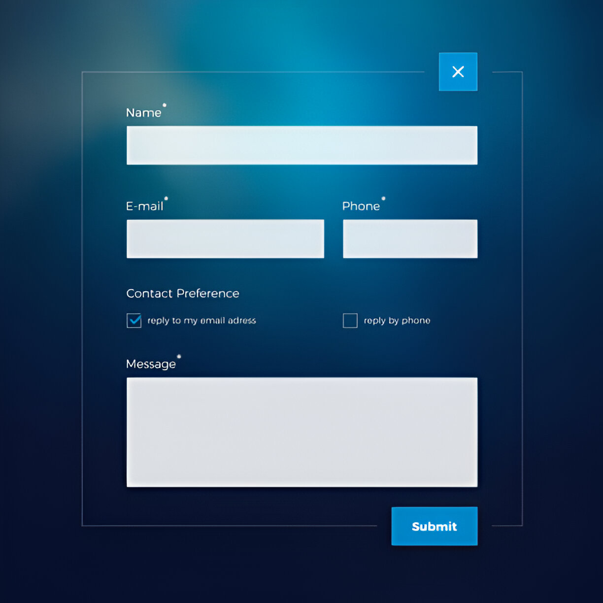
10. Provide Easy-to-Use Contact Forms

Making it simple for users to get in touch with you is crucial for a professional website. One of the best ways to do this is by providing easy-to-use contact forms. Contact forms can be placed on their own page, in the footer, or even in the sidebar for quick access.
There are several plugins available for WordPress that make creating these forms a breeze. For instance, WPForms is a drag & drop WordPress form builder that’s easy and powerful. You can create contact forms, feedback forms, subscription forms, and even payment forms with it.
Here are some tips for creating effective contact forms:
- Keep it simple: Only ask for the information you really need.
- Use clear labels: Make sure each field is clearly labeled so users know what information to provide.
- Add a success message: Let users know their message has been sent successfully.
By following these tips, you can ensure that your contact forms are user-friendly and effective.
Final Thoughts
In conclusion, building a professional-looking website on WordPress doesn’t have to be a daunting task. By following these ten essential tips, you can create a site that not only looks great but also functions smoothly. Remember to keep your design simple and clean, use high-quality images, and ensure your site is mobile-friendly. Don’t forget the importance of easy navigation and clear calls to action. With a bit of effort and attention to detail, your DIY website can stand out and make a lasting impression. Happy designing!


One thought on “10 Essential WordPress Web Design Tips for a Professional Website”