Choosing the right font for your website is a big deal. Fonts do more than just make your text look good; they affect how easy your content is to read and can even shape how visitors feel about your site. With so many fonts out there, picking the perfect one can be tough. That’s why we’ve put together this guide to help you find the best fonts for your website. Here are our top 10 picks, each offering something special to make your site stand out.
Best Fonts for Your Website
- Lato is a warm and readable sans-serif font, perfect for professional yet friendly websites.
- Merriweather is a serif font designed for reading on screens, making it ideal for long articles and blog posts.
- Alegreya offers a dynamic and varied rhythm, breaking up the monotony of long texts and is available in both serif and sans-serif.
- Arvo is a geometric slab-serif font, great for headlines and attention-grabbing text.
- Amatic SC is a quirky, hand-drawn font that adds a personal touch to creative websites.
Lato
Lato is a fantastic sans serif font designed by Łukasz Dziedzic. It’s perfect for both titles and body text. The font’s name, Lato, means summer in Polish, which reflects its upbeat and cheerful vibe. This font is clear, warm, and strong, making it very readable.
Lato is available in nine weights, from hairline (100) to black (900). It supports over a hundred Latin and Cyrillic languages, including many languages from the Americas. This versatility makes it a great choice for various types of websites.
You can easily download Lato from Google Fonts and even pair it nicely with other fonts like Open Sans. Whether you’re using it for headings or paragraphs, Lato will give your website a harmonious and welcoming feel.
Merriweather
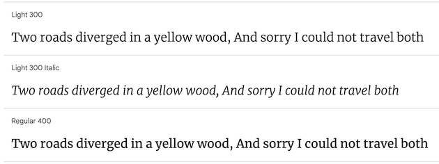
Merriweather is an excellent choice if you want something readable and modern. Although it is a simple font, its subtle strokes give it a more sophisticated look. It’s perfect for long-form content like blog posts or articles because it’s easy on the eyes.
Why Choose Merriweather?
- Readability: One of the best features of Merriweather is its readability. Whether it’s on a desktop or a mobile device, the font remains clear and easy to read.
- Versatility: This font works well in various settings, from professional websites to personal blogs.
- Modern Look: Despite its simplicity, Merriweather has a modern feel that can make your website look up-to-date.
Best Uses for Merriweather
- Blog Posts: Ideal for long articles where readability is crucial.
- Professional Websites: Suitable for business sites that need a clean, modern look.
- Personal Blogs: Adds a touch of sophistication without being too flashy.
If you’re looking for a font that combines readability with a modern aesthetic, Merriweather is a fantastic option.
Alegreya
Alegreya is a fantastic choice if you’re looking for a font with a classic feel. Originally designed for literature, it’s perfect for long bodies of text. Its dynamic and varied rhythm helps break up the visual monotony, making it easier to read lengthy passages. This makes it a great option for text-heavy websites, like blogs or news sites.
One of the cool things about Alegreya is that it comes in both serif and sans serif variations. This gives you the flexibility to use it in different parts of your website, whether it’s for headings or body text. The serif version has a more traditional look, while the sans serif version feels a bit more modern.
If you want a font that has its own distinctive personality and is rich in details, Alegreya is a solid pick. It’s not just another boring typeface; it has character and flair, making your content stand out. So, if you’re aiming for a humanist sans vibe, give Alegreya a try.
Arvo
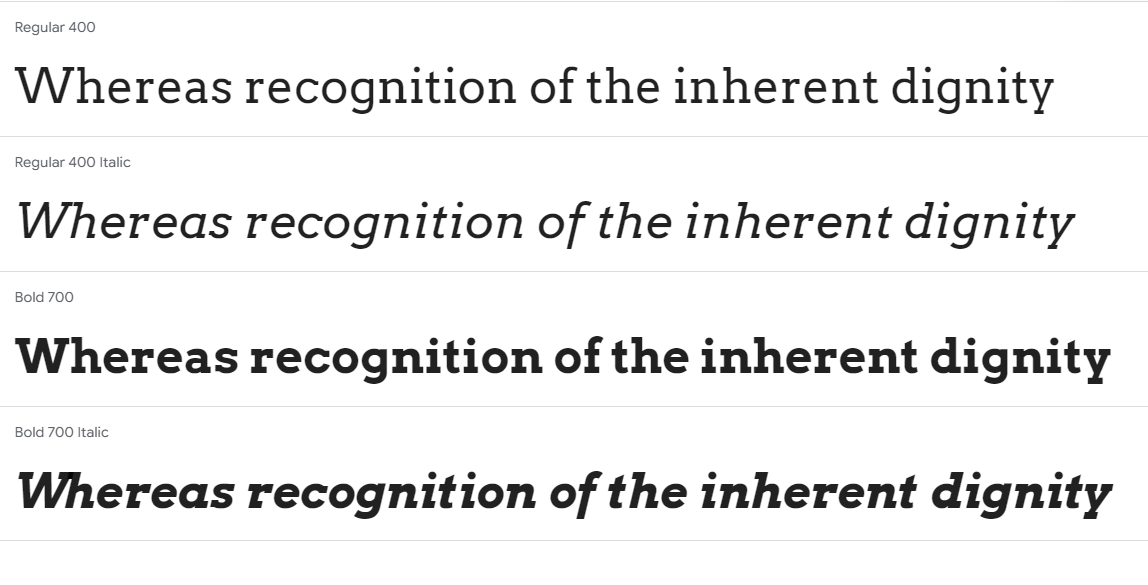
Arvo is a fantastic choice if you’re looking for a geometric slab-serif font. Designed by Anton Koovit in 2010, this font is known for its distinct block-like serifs. It’s a free font, which is always a plus!
One of the best things about Arvo is its versatility. It comes in four different styles: regular, regular italic, bold, and bold italic. This makes it suitable for various uses, from headings to testimonial text. Arvo is especially great for heading text because of its clear and legible design.
If you’re working on a web design project, Arvo should definitely be on your list of fonts to consider. Its readability on screens makes it a reliable choice for any kind of operating system or screen size.
Amatic SC
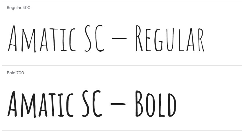
Amatic SC is a delightful hand-drawn font that’s perfect for headings. It’s simple and playful, making it a great choice for adding a touch of fun to your website. Despite its playful nature, it doesn’t sacrifice readability for style.
One of the standout features of Amatic SC is its creative and brush texture appearance. The characters in this font are designed with a thin brush, giving it a unique and artistic look. This makes it ideal for websites that want to convey a creative and informal vibe.
If you’re looking for a font that combines creativity with readability, Amatic SC is definitely worth considering. It’s especially great for headings and titles, where you want to grab attention without overwhelming the reader.
Josefin Slab

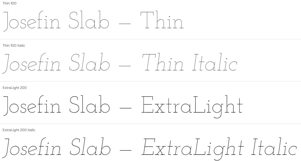
Josefin Slab is a modern, stylish font that’s perfect for bringing a sophisticated tone to any website. It works well for main copy, and would look good next to headings in Amatic SC. Josefin Sans Bold and Josefin Sans are highly regarded as an excellent choice for a Shopify font pairing due to their seamless integration of the bold and regular styles.
Bowlby One SC

Bowlby One SC is a font designed specifically for headings. It has a bold and impactful look, making it perfect for titles that need to stand out. However, it only comes in one style, so it’s not suitable for main body text.
If you’re looking for a font that brings personality and performance to your website, Bowlby One SC is a great choice. Its slightly rough edges give it a unique character that can make your headings pop.
Key Features
- Bold and Impactful: Ideal for titles and headings.
- Unique Character: Slightly rough edges add a distinctive touch.
- Limited Styles: Only available in one style, so best used for headings.
When to Use Bowlby One SC
- Perfect for websites that need strong, attention-grabbing headings.
- Not recommended for main body text due to its single style.
In summary, Bowlby One SC is a fantastic option if you want your headings to be bold and eye-catching. Just remember, it’s best used sparingly and not for long paragraphs.
Dancing Script
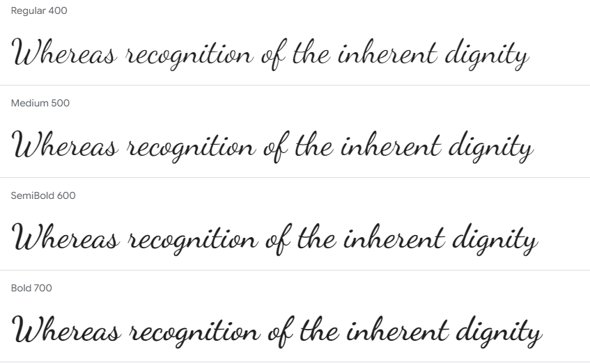
If you’re looking for a font that feels like handwriting but still looks classy, you should check out Dancing Script. This font has a nice, spontaneous feel to it, making it perfect for adding a touch of elegance without being too formal. It’s great for headings and pairs well with Lato.
Dancing Script is lively and fun, which makes it ideal for creative projects. Whether you’re designing a website for a festival or an artsy blog, this font can help convey a sense of creativity and playfulness. Just remember, it’s best used in larger text sizes to maintain readability.
Playfair Display SC
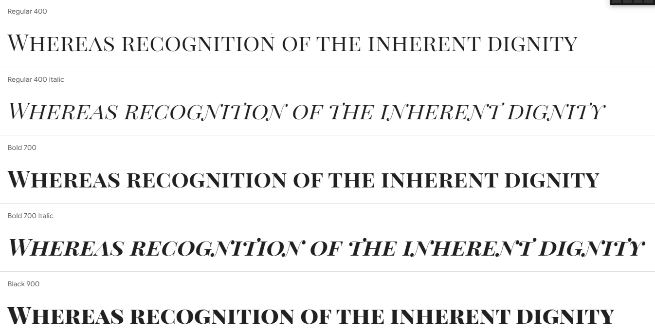
Playfair Display SC is a bold serif font that commands attention. With its more rounded flourishes, it has a more playful feel than your typical serif font. This makes it perfect for headlines and titles on your website.
One of the things I love about Playfair Display SC is its versatility. It works well in both large and small text sizes, making it a great choice for various design needs. Whether you’re using it for a headline or a subheading, it always looks sharp and professional.
If you’re looking for a font that combines elegance with a modern touch, Playfair Display SC is definitely worth considering. It can give your website a sophisticated yet approachable vibe, making it stand out from the crowd.
Poppins
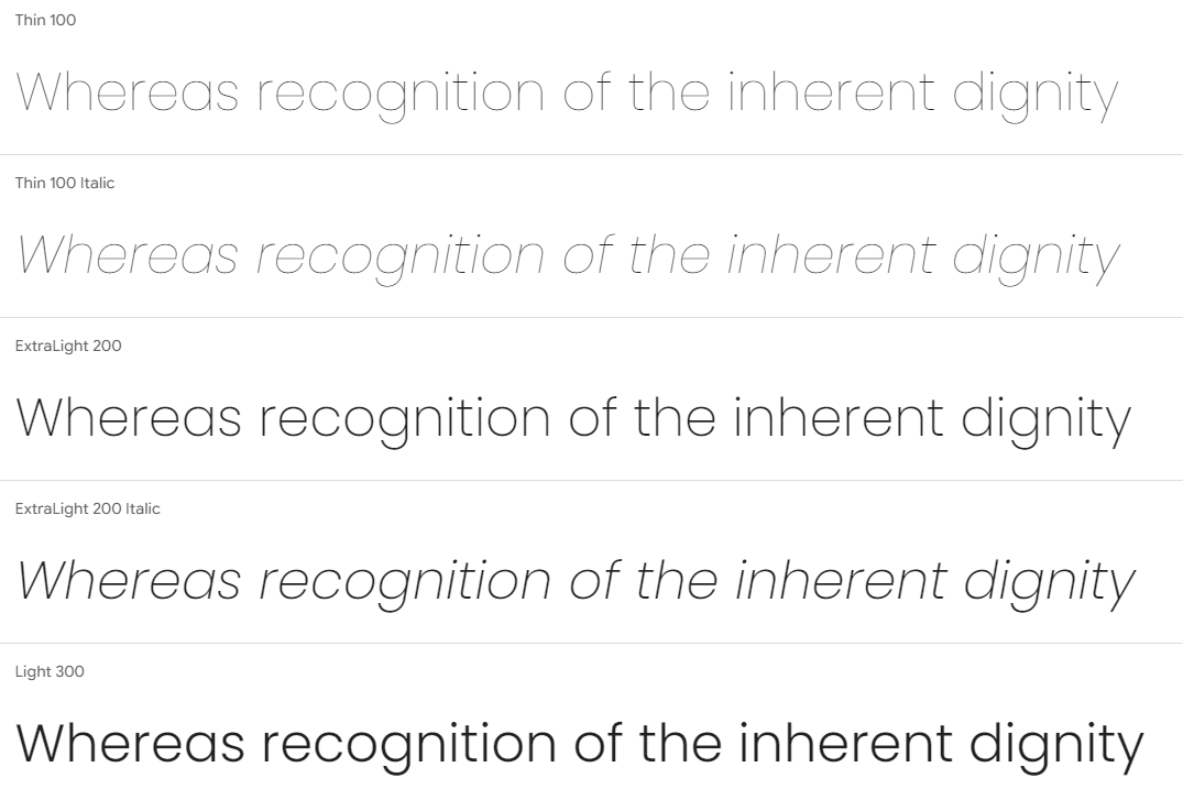
Poppins is a sans serif font that stands out for its versatility. It can handle characters from both Latin alphabets and the Devanagari system, making it a great choice for international websites. Its geometric shapes keep the type readable in small sizes, while its modern yet timeless curves look striking on big screens or mobile devices.
Poppins offers a wide range of styles, from very thin to extra-bold. My favorite is Extra-bold 800, which really makes your headings pop! The font’s OpenType features also offer a ton of potential for customizing text. For example, ligatures can be used to combine two or more characters into one glyph shape, helping designers create more interesting typographic effects without compromising readability.
If you’re looking to self-host the Poppins font, you can easily find the CSS and web font files on the main Fontsource website. This makes it super easy to integrate Poppins into your web projects.
Wrapping Up: Choosing the Perfect Font
Selecting the right font for your website is more than just a design choice—it’s a crucial part of your site’s overall user experience. The fonts you choose can make your content easy to read, convey your brand’s personality, and even influence how visitors feel about your site. With so many options available, it can be overwhelming, but this guide has given you a solid starting point. Remember, the best font for your website is one that aligns with your brand, is easy to read, and looks good on all devices. Happy designing!



2 thoughts on “10 Best Fonts for Your Website – A Complete Guide”